NewSkin/Reviews
Contents
First Review
Ok so I have changed preferences to the new skin and these are some of the things I found:
- The graphics are incredible! I like the way the Edit button is easy to see as well as the color scheme!
- Every feature seemed to work properly and correctly,
- I especially like the "animated" graphics such as the closing eye with "watch"
- I didnt like how it reformatted the Portal Pages. this may be a problem if users are able to switch between them in the future.
- On my personal page It cuts off the right side a little making it difficult to see the menu.
I think it definately livens up the pages and seems more user friendly. Especially as mentioned before the "edit" feature. Thanks for allowing me to include my input and I will look forward to the development teams continuing progress.! Bryan Daugherty
Simon's Notes
I like everything, and haven't seen any problems yet. Two things I would like changed for my own personal preference.
- Move the edit links on pages back to where they were on the right side of the page.
- The grass, atleast part of it in the top left, if it could be clickable to go to the homepage. I'm so use to to clicking there.
- The usefull links is too hard to use, I liked it better when it was part of left nav (now right nav) --Simon | talk 18:40, 5 September 2007 (PDT)
Joey's Notes
- I agree with Simon about the useful links being hard to use. It's not so bad with a mouse, but I've hit the wrong link several times when using the touch pad on my laptop.
- The links in the footer are a little hard to see because they blend in with the background a bit. Could they be changed to a color that doesn't blend in so much? --Joey 19:24, 5 September 2007 (PDT)
MB's Review
I have played with it and tested it for flags and seems to be no problems. I am not fussy about the "useful Links". If I am not so new to the internet, I would not know where a lot of links I want like Home are. It is so small and seems so unimportant. I agree with Simon about these links. Better on the Right Nav--Master Baitor 18:39, 5 September 2007 (PDT)
Another annoying thing is where the useful links are. If you go to flag a site and you put the mouse a little to high as you move, the drop down happens. --Master Baitor 21:29, 5 September 2007 (PDT)
Ward's Observations
I like the new look a lot, and especially the colors. Here are some observations of things that can probably be improved.
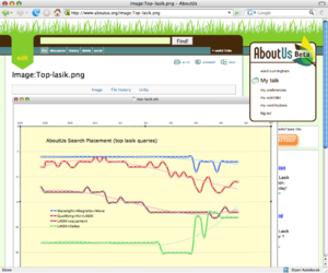
- Image and skin overlap in unexpected way when viewing the image page for uploaded image. See thumb. Page in question is here.
- Can we fit the Ads into the skin's color scheme? They need to look like they belong. If their color scheme is shared between old and new, I'd rather see the new look good at the expense of the old.
Bigger Tabs
I like the colors and the placement of the user box on the right. (not sure what your calling it?) I find myself hunting for the tabs- article, history- granted I have a rather small screen. I am not use to useful links and in general would appreciate the font being a wee larger. Initial thoughts as I am not use to it, but these are the things that stand out. Seems to work well in Camino Kasey 14:19, 6 September 2007 (PDT)
Evenplayn's Review
So far, I love the look and feel. However, I have to things to mention
- Move the AboutUs logo and user info box to the left corner. I thought everyone knew that the upper left corner is where the eye naturally goes.
- I had to switch out of the new skin to leave this comment...couldn't figure out how to edit the page or discuss it. Am I missing something? If I can't figure it out, a new user wont be able to.
Otherwise it is great! --Evenplayn 21:08, 6 September 2007 (PDT)
Michael's Experience
I love the new look. When I clicked Preferences -> Skin, I only saw the "default" aboutus skin as an option. To get the new skin I had to manipulate the page DOM and change the radio button value to "design". I'm using Mac OS X with Firefox 2.0.0.6. --Michael 12:03, 8 September 2007 (PDT)
- Same with Safari - no "design" option for skin. --Michael 12:05, 8 September 2007 (PDT)
MarkDilley's thoughts
Personal area
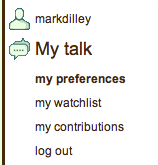
My name is not correct in this new skin, also My talk is prominent, even though I am on my preferences. I think it would be better if we indented under my name, like so:
MarkDilley
- talk
- preferences
- watchlist
- contributions
log out
I like the little logos, but would like them to be consistent. person, talk cloud, watch eye, something for preferences and contributions...
~~ MarkDilley


